How pedestrian- and bike-friendly are various CTA stations, and why?
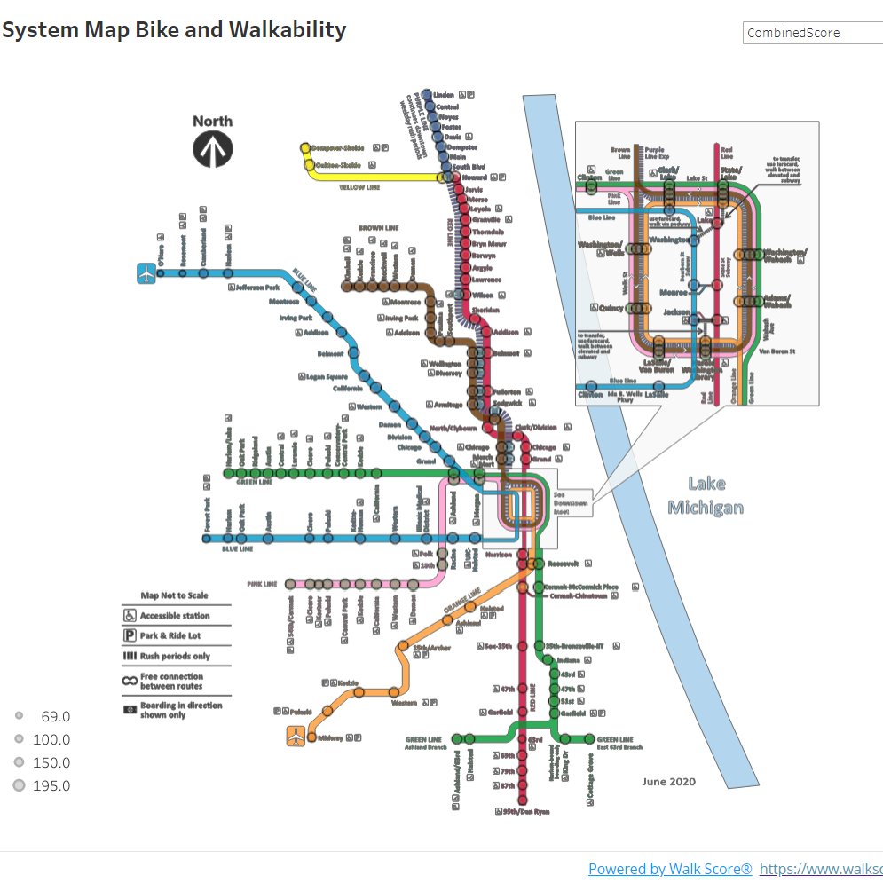
Dale Wunderlich, a designer who has worked in economic development, recently did an interesting urban planning exercise. He created a map and visualization of the most and least bikeable CTA rail stations based on on the Redfin real estate brokerage’s Walk Score and Bike Score ratings. Unsurprisingly, he found that pedestrian- and bike-friendly stations tend to be located in denser parts of town, but they also correlate with wealthier and neighborhoods.
Originally from Lincoln, Nebraska, Wunderlich recently moved back to Chicago, where he attended grad school at IIT, from Manhattan, Kansas, where he worked on projects to encourage economic development and entrepreneurship. He also served as a visualization developer for an all-volunteer news outlet started by a former New York Times editor. Currently he’s looking for a gig in transit advocacy.
Wunderlich used an API (Application Programming Interface) to access data from the Redfin sites. A location’s Walk Score rating is based on the density of nearby amenities like retail, parks, and schools. Walk Score also looks at population density, and factors in the built environment like block length and intersection density.
Bike Score calculates bikeability rating based on factors like the prevalence of bikeways; hills (pretty much a non-issue in Chicago); destinations and road connectivity; and bike commuting mode share.
After plotting out the data across the ‘L’ system, Wunderlich said, “I didn’t see a whole lot that was surprising. For example, the Brown Line is extremely walkable from end to end.”
However, when Wunderlich factored in income and race, he found some troubling correlations. All but a couple of the stations that are below the system average for walkability and bikeability are in communities of color.
That’s due in part to the fact that most of Chicago’s neighborhoods that are dense with people and destinations are majority-white. That in turn reflects patterns of disinvestment in communities of color from the 20th Century, some of which continue to be issues in the modern era. “This perhaps shows the effects of redlining and white flight,” Wunderlich said.
He also noted that many Chicago rapid transit lines were dismantled and stations closed during the urban renewal era and beyond. “Had you done this mapping project before World War II, you would have had very different results.”
Wunderlich has also overlaid the his transit walkability and bikeability map over the Chicago zoning map. He found that there are almost no industrial job sites nowadays that are easily accessible via rapid transit.

Read More:
Streetsblog has migrated to a new comment system. New commenters can register directly in the comments section of any article. Returning commenters: your previous comments and display name have been preserved, but you'll need to reclaim your account by clicking "Forgot your password?" on the sign-in form, entering your email, and following the verification link to set a new password — this is required because passwords could not be carried over during the migration. For questions, contact tips@streetsblog.org.