Eyes on the Street: Roosevelt Bike Lane and Bus Shelters Nearly Complete
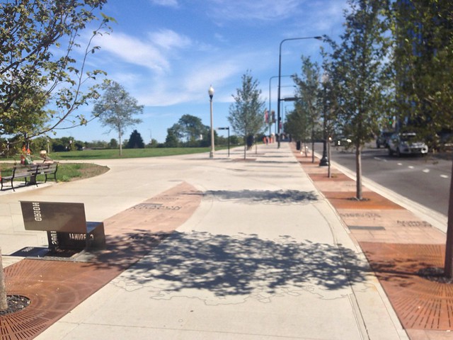
The Chicago Department of Transportation may soon be cutting the ribbon on the Roosevelt Road streetscape and raised bikeway project. The initiative involved widening the sidewalk along Roosevelt between State Street and Michigan Avenue to make room for the two-way bike lane, which replaced conventional bike lanes on the same block of Roosevelt.
The new lanes extend a block or so past Michigan on the north sidewalk of Roosevelt, ending near the trunkless legs of the “Agora” sculptures and the Grant Park skate park. The last major step of the project is to install green pavement markings and bike symbols on the bike lanes. CDOT recently posted on Facebook that work will be done by November.
As part of the Roosevelt streetscape, crews installed new metal benches in places where people might actually want to sit. That’s not a given, considering that many of the benches put in as part of a similar road diet project on Lawrence Avenue in Ravenswood wound up facing blank walls or parking lots.
The Roosevelt benches, as well as decorative pavers inscribed with an odd group of words that are meant to be thought-provoking, or evoke the cultural facilities of the nearby Museum Campus.
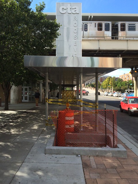
Near the CTA ‘L’ station at Roosevelt and State, which serves the Red, Orange, and Green Lines, the department has installed extra-long bus shelters that will have ad panels. The #12 Roosevelt, #18 16th-18th, and #146 Museum Campus buses stop at this location. Above the canopies are massive vertical structures with the CTA’s logo and station name.
Between State and Wabash Avenue, the bikeway will exist as a pair of one-way bike lanes (just like now), located in the street. Eastbound bicyclists will use a special “crossbike” – a crosswalk for bikes – to move to the bi-directional raised bike lane on the north side of Roosevelt east of Wabash.
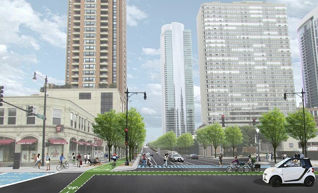
The old Roosevelt bike lane disappeared just before reaching Grant Park and the Lakefront Trail, so the raised lanes will fill that gap. That’s important, because the city’s goal is to create more safe bike routes between neighborhoods and the popular path.
The sidewalk level bike lane has been usable as a bike path for six months (since April), but not always. That’s because people would walk on the path intended for bicycling. They do this at no fault to themselves because the sidewalk and bike lane have an identical design. Markings and stripes on the ground will help distinguish walking and bicycling areas considerably but it’s common in other cities, including on the Indianapolis Cultural Trail, to use markedly different designs for walking and bicycling paths.
The bus shelter and station identification structure at the train station are also a mixed bag of design decisions. Bus stop shelters are always a welcome addition, and this one is sufficiently long, covering the entire walk from the Roosevelt ‘L’ entrance to the bus stop.
Our city is increasingly covering transportation infrastructure with advertisements (including in dirty Lakefront Trail underpasses), however, and this has made its way to this canopy. There are two poorly designed advertising stanchions within the canopy’s structure.
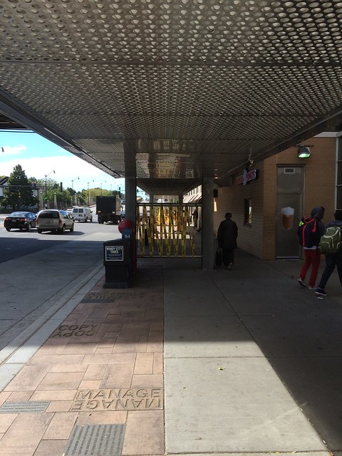
The advertisements will occupy about half the busy sidewalks and block the views of other people and street and sidewalk activity that’s essential to maintaining personal safety. The Roosevelt stanchions are slightly different than “city information” signs which litter downtown blocks with more advertisements (alongside advertisements on newspaper boxes, news stands, trash cans, and bus stop shelters).
Instead of slim poles holding them up, wide columns carry the signs and comparatively block more of the view around them. Coupled with the low ceiling of the canopy, which will block ambient light and sunlight, the lighting under the canopy will have to be bright and well-maintained to give the sidewalk adequate street safety lighting.
Beyond the functional use of the bus shelter canopy, the structure also advertises the CTA ‘L’ station, but the station didn’t need it. The CTA advertises for itself on the station, with a brightly-lit logo and backlit symbols for bus and train. There’s also the fact that the train platform and tracks serve as their own marker for a rapid transit station.
The signs on the shelters are another example of an expensive, arguably low-utility, CDOT signage project. The department has previously spent a total of $760,000 of tax increment financing funds on signs over Argyle Street and Fulton Market. A better use of funding would be projects that actually improve the transportation network, such as renovating train stations, building new bike lanes, and fixing broken sidewalks.
Read More:
Streetsblog has migrated to a new comment system. New commenters can register directly in the comments section of any article. Returning commenters: your previous comments and display name have been preserved, but you'll need to reclaim your account by clicking "Forgot your password?" on the sign-in form, entering your email, and following the verification link to set a new password — this is required because passwords could not be carried over during the migration. For questions, contact tips@streetsblog.org.

