Mapping the Potential for Development Near ‘L’ Stations
Do Chicago’s zoning rules position the city for transit-oriented growth?
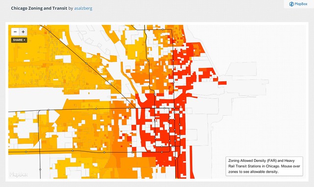
Last week, Andrew Salzberg, a D.C.-based transportation consultant who works for the World Bank, posted a link on Twitter to a new map he’s created that overlays CTA rail lines and stations with how much development is allowed. It’s an attempt to show if zoning in Chicago is set up to concentrate development near transit.
Focusing development around rail stations curbs traffic and improves people’s mobility by increasing the number of destinations and services accessible by transit. It can also lower household transportation costs. People typically spend more on transportation than anything except housing, but as the Center for Neighborhood Technology’s Housing + Transportation Affordability Index demonstrates, living in a “location-efficient neighborhood” with lots of amenities and access to transit lets people spend less on transportation.
I emailed Salzberg to learn more about why he made the map and what he thinks it says about Chicago zoning and transit-oriented planning.
Steven Vance: What is the map showing?
Andrew Salzberg: The map focuses down on one element of zoning – maximum allowable FAR – and ignores all the other important variables (most obviously land use). This one indicator of density is then overlaid on the map of the CTA rail system.
[FAR, or floor area ratio, is the ratio of a building’s total floor area to its parcel’s area. For example, if a building occupied an entire parcel and was two stories tall, it would have a FAR of 2.0. The higher the FAR, the “denser” a building and neighborhood.]
SV: Why did you create it?
AS: The purpose of the map was to get a quick sense of the degree to which zoning in Chicago fosters higher development potential near transit.
SV: Have you made any observations about it? Done any analysis? What relationships are you seeing?
AS: A few things are immediately obvious – Chicago’s downtown core in and around the loop jumps off the page since zoning there allows for FARs over 10 – densities not approached anywhere else in the city. Chicago is pretty clearly a strongly monocentric city based on this map (although I have never actually had the pleasure of visiting). It also doesn’t take much to see how clearly focused the rail transit system serves this high density area.
It’s clear this is a pretty gross oversimplification of both zoning and transit service. On the zoning side, I’m only mapping the maximum allowable FAR for zones that have an FAR labeled in Second City Zoning’s fact sheet they put together on Chicago zoning. This ignores all the ways the other “non FAR” elements of the code can influence allowed density: limits on units per lot, minimum lot sizes, or setbacks, among other elements.
On the transit side the map presents elevated stations and lines, and completely ignores bus and Metra service. This is a quick shorthand for transit service that could definitely be improved. I’m working on a way to do a more comprehensive mapping transit service accessibility using Chicago’s GTFS files [schedules that allow Google Maps and other apps to provide trip directions] to get a more comprehensive measure of transit service across all modes.
Further out, at first glance, it’s not clear that areas within walking distance of transit are being “upzoned” to allow for higher densities – although I’d want to do more research to actually see if that’s the case. It looks like commercial corridors along major arterials are higher density (as high as FAR 3) than surrounding residential areas, but you can’t clearly see anything like a radial pattern of higher density around transit as you might in other contexts.
The final thing you notice is just how much of the city is made up of Planned Urban Development zones (PUDs) where the detailed design regulations are negotiated for individual plots of land.
SV: Where did you get the data?
AS: The data for the basic Chicago zones and transit data comes from Chicago’s great data program and the FAR for each zone comes from the hard clean-up work by Open City Apps.
Washington, D.C., supplies similar data – but it will also need some of the hard elbow grease to get the data cleaned up in the way the Open City guys did. I’m hoping to rally some people to that cause at Open Data Day in DC.

Read More:
Streetsblog has migrated to a new comment system. New commenters can register directly in the comments section of any article. Returning commenters: your previous comments and display name have been preserved, but you'll need to reclaim your account by clicking "Forgot your password?" on the sign-in form, entering your email, and following the verification link to set a new password — this is required because passwords could not be carried over during the migration. For questions, contact tips@streetsblog.org.