How Do We Divvy? Data Challenge Winners Find Out
Divvy announced the Divvy Data Challenge‘s six winners this morning on its website. I talked to three winners to learn how they created their submissions, and what they learned about Divvy users in the process. The Data Challenge began February 11, when Divvy released data about 759,788 trips taken in 2013 and asked the public to create visualizations of numbers and patterns about bike-share in Chicago.
Most creative
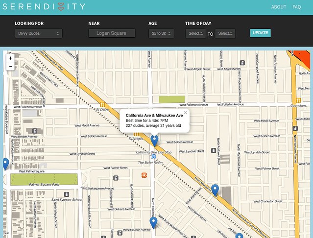
This category had two winners since, as Divvy says, “Serendivvity and Sound of Divvy were both so creative, we couldn’t pick just one winner!” Serendivvity is a “parody of a dating website based on the gender and age data aggregated” from Divvy members. It was created by designers Alex Killough, Craig Clark, Sabella Flagg, Stephen Menton, and Theresa Stewart of gravitytank.
Serendivvity visitors are asked if they’re looking for “dames” or “dudes,” and in which neighborhood. In other words, Serendivvity is a map that can tell someone when to show up at which Divvy dock to “meet a rider of their preference.”
What did the team find out? Killough said, “it was surprising to see how large the gender imbalance is across all stations,” with men taking most Divvy rides. However, some stations sometimes buck this trend. As an example, he cites the Clark and Lincoln station at the eastern edge of Lincoln Park, with “96 percent female subscribers between 5 and 6 a.m.”
Best overall visualization
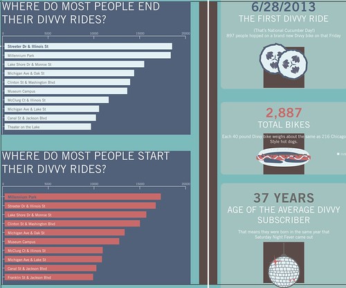
Jess Baker won in the “best overall visualization” category because her graphic [PDF] “successfully communicates a broad range of useful and insightful information in an aesthetically pleasing way.” She studied architecture in Ohio and ran a knitting business in Brooklyn before moving to Chicago about a year ago, where she now works in social media and marketing.
Baker said that her visualization “illustrates every aspect of Divvy’s inaugural year.” It shows who used it, and where they were going, in a “very Chicago-centric way.” One example she drew is that the oldest Divvy subscriber reported being born in 1907, the year the Cubs won their first World Series championship. Baker expressed doubt that this Divvy member reported their birth year accurately.
Her goal, she said, was to make it “easy to understand to people who were unfamiliar with Divvy.” Like other entrants, Baker noticed a “gender divide among Divvy subscribers,” a topic we’ve explored recently. “I can’t think of a reason,” she said, “that would explain why the demographics break down that way. I feel like I see an equal number of girls and guys riding the bright blue bikes around.”
As for her own Divvy experience, Baker says “I haven’t used it yet. I’m very intimidated when it comes riding in cities, but I’m excited to start.”
Most insightful
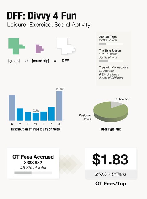
Rodney Louie, vice president of operations and strategy at Fulcrum Chicago, created “Divvy For Fun” [PDF]. Louie set out to find “interesting and useful patterns in the data.” The results comprised three kinds of user and trip characteristics. He developed methods to count groups riding together, non-stop or indirect trips, and round trips. Divvy does not disclose which user took which bike, but by using trip data, Louie can reliably assume that the same person made a round trip on two different bikes.
What did he find? “I found it surprising that nearly 25 percent of the trips taken were a part of a group,” Louie said. Louie defined group rides as when a rider “and at least one other [person] depart from the same station within three minutes of the other, and arrive at the same [destination] station within three minutes of the other.”
The name “Divvy For Fun” comes from two “data subsets” – group trips and round trips – that he classified as “leisure, exercise, social activity” rides. These leisurely excursions comprise 27.9 percent of all trips, yet consume 39.1 percent of all time ridden. Daily pass holders are much more likely to make these trips, accounting for 84.2 percent of leisure trips, and about half of leisure trips are taken on the two weekend days. Leisure trips paid just less than half (45.8 percent) of all overtime fees, but paid more in overtime per trip since there are fewer such trips.
Louie said his tools included “lots of coffee.” In addition to being surprised by how many trips were taken in groups, Louie was surprised that the Piper’s Alley Starbucks is “consistently busy after midnight.” This observation came from working on “Divvy For Fun” there, rather than from Divvy’s data.
Other entries
Streetsblog contributor Daniel Ronan also submitted a visualization to the challenge [PDF], focusing on the gender imbalance. He made a map that shows the ratio of male-to-female member use at each station. He found that only two stations have more women members than men. He said his visualization “sheds light on how much work Chicago has to encourage female Divvy, and overall biking, ridership,” and on “building bicycle infrastructure that allows women to feel safe while riding bikes.”
Four other challenge entrants will demonstrate their submissions tomorrow evening at at 6 p.m., during the Chicago Data Visualization Group meeting at 430 N Michigan Ave. They include Shaun Jacobsen, whose Divvy Explorer we featured earlier, Gabe Gaster and Aaron Wolf’s Voronoi diagram, and Drew DePriest’s geographic analysis.
Read More:
Streetsblog has migrated to a new comment system. New commenters can register directly in the comments section of any article. Returning commenters: your previous comments and display name have been preserved, but you'll need to reclaim your account by clicking "Forgot your password?" on the sign-in form, entering your email, and following the verification link to set a new password — this is required because passwords could not be carried over during the migration. For questions, contact tips@streetsblog.org.

