CTA is moving “digital destination signs,” LED route info on front of bus above windshield, to left side of screen
Recently the CTA has been piloting tactile bus signs to help make riding the bus more accessible for Chicagoans with vision impairments.
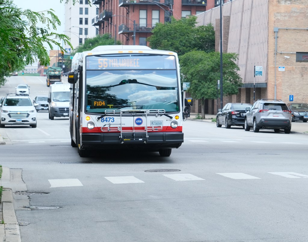
Today the transportation agency informed Streetsblog Chicago about its latest latest attempt at improving accessibility. In the past the “digital destination signs,” LED signage located above the windshield on the front of buses, have featured street names and other information displayed in the center of the screen. That info is now being being shown “left-aligned,” at the left side of the screen, right next to the route number.
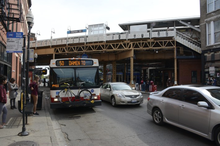
“You may soon begin to notice that the bus destination signs on the front of buses are left-aligned,” CTA spokesperson Maddie Kilgannon told Streetsblog. “It’s a new feature we’ve begun to roll out as an accessibility and usability improvement.”
Kilgannon said the CTA management understands that the sign tweak is a visual adjustment that may look a little odd at first, “so we wanted to help explain to riders and Chicagoans why we’re doing this.”
According to Kilgannon, the new design puts the text closer to riders waiting for the bus on the sidewalk. “And it makes it easier for people’s eyes to home back to the same spot as info cycles or wraps two lines, which can make reading easier for some.”
Kilgannon added that the design is also intended to improve wayfinding at locations where there are many buses with different routes and destinations on the same street, such Michigan Avenue. “If you have two different buses in a row, the first blocks the second initially. But, as the first one pulls away, you’ll first be able to see the left side of the destination sign.”
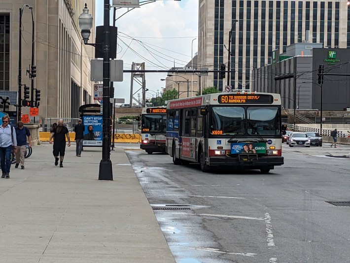
“This is also expected to be easier for to read,” Kilgannon said. “As signs change, people’s sight won’t have to home back to different starting positions on the sign per word of text, which helps people who have visual disabilities where they need a monoscope or have muscular issues where it’s hard to keep one’s eyes steady and focused, or even people with cognitive disabilities who find text positions jumping around, a result of centering, difficult to perceive.”
Kilgannon also mentioned that’s it’s helpful the new signs just fixate on the bus’ destination. “So if you’re rushing up to a bus and it’s a #151 but you need a specific iteration, you don’t have to stand there to wait for the sign to flip from ‘Sheridan’ to telling you whether it’s one up to Clark/Devon or one just up to Belmont/Halsted or whatever because once the bus doors are open you may have to make a split second decision or miss the bus as they close the doors.”
Here’s hoping that this subtle change in CTA sign design is handy for all CTA bus rider, but particularly helpful to those with visual challenges.

Read More:
Streetsblog has migrated to a new comment system. New commenters can register directly in the comments section of any article. Returning commenters: your previous comments and display name have been preserved, but you'll need to reclaim your account by clicking "Forgot your password?" on the sign-in form, entering your email, and following the verification link to set a new password — this is required because passwords could not be carried over during the migration. For questions, contact tips@streetsblog.org.