Why it’s difficult for newbies to navigate Metra, and how it can be made easier
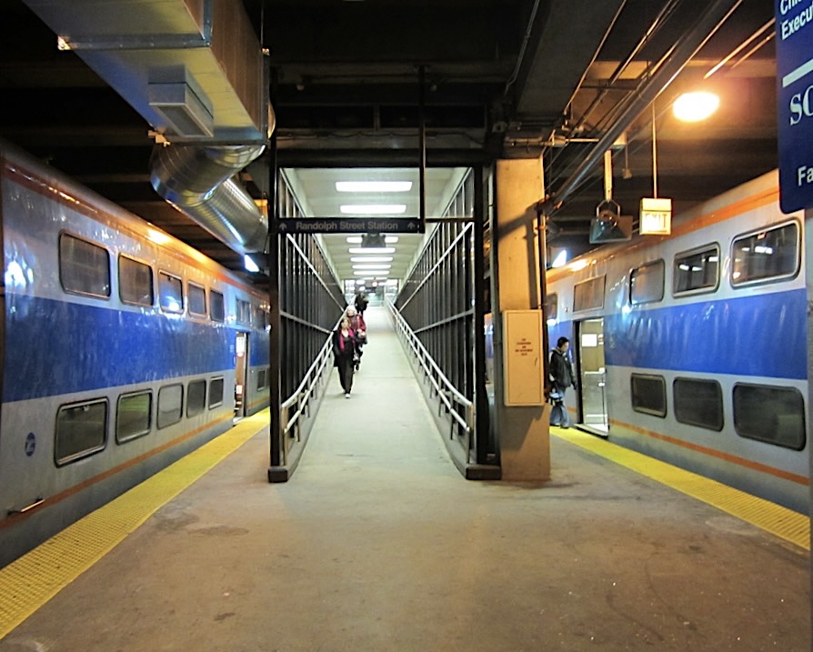
For many years, transit advocates have tirelessly pushed Chicagoland’s Metra commuter railroad to better serve riders outside of its traditional base of suburbanites commuting to jobs in the Loop. Metra’s Covid-19-induced ridership decline and slow recovery threaten the medium- and longterm fiscal viability of the agency, and in response, Metra has claimed it’s interested in attracting riders beyond its traditional constituency.
Indeed, Metra’s recovery has been much stronger during off-peak times and on weekends on many of its lines. Nonetheless, Metra’s operational paradigm is still squarely focused on providing service to 9-to-5 downtown workers, with service heavily concentrated during rush hours. While I disagree with the railroad’s scheduling and service choices, in some ways I can understand the reluctance to make changes that Metra’s managers believe might compromise service for its traditional ridership.
But what is totally inexcusable is the low quality of wayfinding and information design throughout Metra stations and onboard the trains. The system is notoriously challenging for first-time or occasional users to navigate, and this difficulty is a major barrier to attracting the kind of riders who are critical for the agency’s ridership recovery.
Let’s take a look at Metra’s various wayfinding fails by viewing the issue through the eyes of someone riding Metra for the first time, from a first person perspective. (All of the images below can be clicked to enlarge them.) The blue text in the images below represents the thought processes of a hypothetical Chicagoan taking the Metra Electric District line for the first time, for a trip from the Loop to visit Hyde Park. The red text is my commentary on the wayfinding problems that person would encounter.
The MED presents a particularly strong opportunity to serve new, nontraditional commute riders, since it serves many tourist destinations and dense, urban neighborhoods with low rates of car ownership. That potential will balloon when the Obama Presidential Center opens, offering a major new attraction for city dwellers and visitors alike.
Over a billion dollars in capital improvements are planned in the coming years for Metra, including many millions for the MED. Wayfinding and information design improvements are trivially cheap in comparison. It is often said that American agencies will spend $60K to attract a single new weekday rider. Metal signs are priced in the hundreds to thousands of dollars, and decals even less. The Illinois Central Railroad, the private operator that built what is now the Metra Electric infrastructure, included destination signs and route diagrams onboard its trains. Even digital signage is cheap nowadays – these displays cost as little as a few thousand dollars per sign, and writing the code for a digital countdown clock is a simple project for an experienced developer. There are also opportunities to subsidize this kind of signage through advertising, as the CTA has done in recent years.
Metra’s low quality wayfinding also may present a serious accessibility challenge to deaf users. Although in principle deaf riders could consult schedules and look at station signs, the lack of external or internal signage on the train indicating destinations and routes means deaf riders receive much less information about the service than hearing riders who can perceive audio announcements. What is especially egregious is how Metra will make unplanned changes to service and only provide information about the changes over the intercom. I recently rode a delayed Metra Electric train that shifted to all flag stops (stops that will only be made if a rider requests them) to recoup lost time and only announced this over the intercom. In this scenario, a deaf rider would simply miss their intended stop if another passenger had not requested it. Others have reported similar incidents.
Let’s also address the Regional Transportation Authority’s recent attempts at wayfinding improvements. The RTA’s efforts have much to admire, in particular the emphasis on legibility and aesthetic consistency, and the attempt to facilitate transfers between Metra, Pace, and the CTA. The RTA project has a number of serious shortcomings, however.
First, the program is very limited in scope – it only applies to interagency locations, and has been rolled out to 19 stations, out of almost 400 rail stations and countless bus stops across the three agencies. Second, the project is separate from the individual agencies’ wayfinding and information design programs. In the context of Millenium and other Metra stations, it becomes just another layer, deployed in a piecemeal fashion on top of other wayfinding aids. Multiple overlapping and inconsistent wayfinding standards is not best practice, and it is exactly the problem Massimo Vignelli diagnosed in the NYC subway when he began its iconic overhaul.
Metra should look to other agencies in the U.S., but also overseas, with strong traditions of wayfinding and information design and work towards an internal standard that is clear and consistent, and that is implemented comprehensively. See some examples of better practices below.
Metra has a general obligation to serve the transit needs of Chicagoland residents as well a fiduciary obligation to taxpayers as the steward of billions of dollars in capital and operational subsidies. I see neglecting wayfinding – an extremely useful, high ROI, inexpensive investment – to be a failure to fulfill that duty. Metra really has no excuse on this one. It just needs to do better.
Footnote:
- Metra’s line nomenclature is inconsistent and confusing, including a mix of legacy private railroad names, geographic descriptions, and in the case of Metra Electric District, its power source. Metra should ideally shift to a less confusing nomenclature – designating lines by terminal station name and/or by an alphanumeric symbol, with a corresponding color, which is common across many systems that are known for their legibility and information design. Metra’s use of train line colors in informational materials is very haphazard in general.
Streetsblog has migrated to a new comment system. New commenters can register directly in the comments section of any article. Returning commenters: your previous comments and display name have been preserved, but you'll need to reclaim your account by clicking "Forgot your password?" on the sign-in form, entering your email, and following the verification link to set a new password — this is required because passwords could not be carried over during the migration. For questions, contact tips@streetsblog.org.

