CDOT, 48th Ward Address the Learning Curve for the Argyle Shared Street
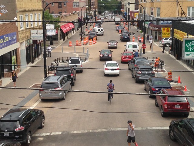
The Argyle Shared Street project, designed to calm traffic, provide more space for pedestrians and sidewalk cafes, creating a safer, more pleasant, and more profitable business strip, is a great idea. But so far the layout for the streetscape initiative, which raised the street up to sidewalk level and blurred the lines between pedestrian and vehicle space, has not proved to be intuitive for drivers.
The nearly completed $3.6 million streetscape is supposed to be a two-way street, with a subtle chicane effect caused by staggered planter and parking spot locations, intended to slow drivers down to safe speeds, but it’s not functioning that way yet. They’re often parking in the wrong locations relative to the designated “sidewalk” area and the center of the road.
That means the chicane effect isn’t happening and the street feels too narrow in some locations for safe two-way traffic. As a result, motorists are treating Argyle as a one-way eastbound street, and they’re only parking their cars facing east.
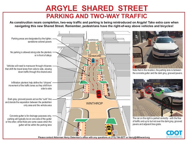
Their confusion is completely understandable because the streetscape design is, frankly, confusing. It turns out that the parking areas are designated by the lighter, sandstone-colored street pavers. The dark grey, grooved pavers are supposed to act as the curb line and denote the separation between the pedestrian area and the parking area.
But I’ve done multiple “Eyes on the Street” posts about the streetscape, and I only learned the color-coding system because the Chicago Department of Transportation recently released a how-to guide for the streetscape. The parking protocol is not obvious at all.
In fact, it’s counter-intuitive because the street also features cream-colored gutters. On a typical street you park just to the left of the gutter. (Of course, on protected bike lane streets it’s often a different story, since the parking lane may be located to the left of bike lane, but in those cases CDOT usually marks a big “P” in the parking lane.)
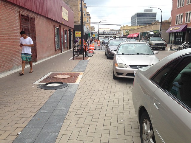
But the CDOT handout says the gutters on Argyle are largely irrelevant to where you’re supposed to park. “Concrete gutter is for drainage purposes only,” it states. “Parking will typically be on one side of the gutter or the other, where there are some cases where the gutter will be within the parking lane.” Clear as mud.
Most Chicagoans aren’t mind readers. There’s no way for a casual observer to guess what CDOT and architecture firm Site Design Group had in mind. That’s not to say that the shared street is a bad design overall. Rather, it’s a good design that needs more signposting, figuratively and literally.
Fortunately, that’s what’s planned. 48th Ward alderman Harry Osterman told the website Uptown Update, “We are also working with CDOT to determine what kind of additional permanent or temporary signage is required to help drivers easily understand how to use the Shared Street.” He added that volunteers may be recruited to help direct parking while drivers get used to the new layout.
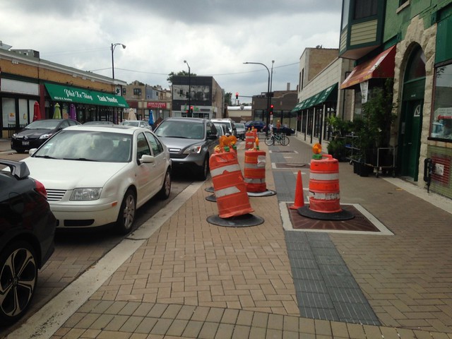
Obviously, it’s not an ideal situation when your new streetscape needs ambassadors to explain to people how to use it. But as word spreads in the neighborhood about the proper way to park in Argyle and helpful signs and/or additional street markings are added, the learning curved should soon become a thing of the past.
That’s when the shared street will begin to reach its full potential for making Argyle more livable. And once attractive greenery is added to the large planters, I’m confident the city will start receiving fewer complaints and more compliments about this innovative project.
Read More:
Streetsblog has migrated to a new comment system. New commenters can register directly in the comments section of any article. Returning commenters: your previous comments and display name have been preserved, but you'll need to reclaim your account by clicking "Forgot your password?" on the sign-in form, entering your email, and following the verification link to set a new password — this is required because passwords could not be carried over during the migration. For questions, contact tips@streetsblog.org.

